Visual identity design
Piattini foodbar
Designed to be as layered as the menu, the Piattini logo features an elongated “P” that serves as a platter for the letters above. Inspired by the owners’ Venetian heritage, the vibrant orange and green palette brings the spirit of Venice to the Amsterdam food scene through clean typography and high-impact signage.
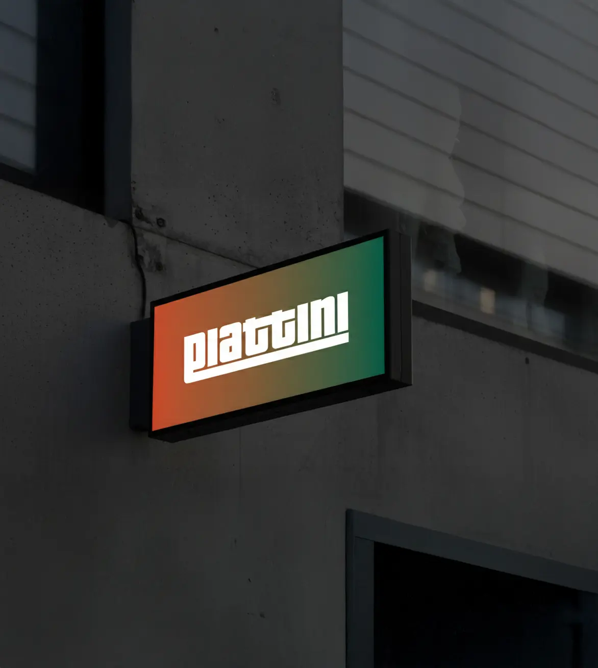
This lightbox ensures the blocky, geometric logo remains legible and striking from a distance.
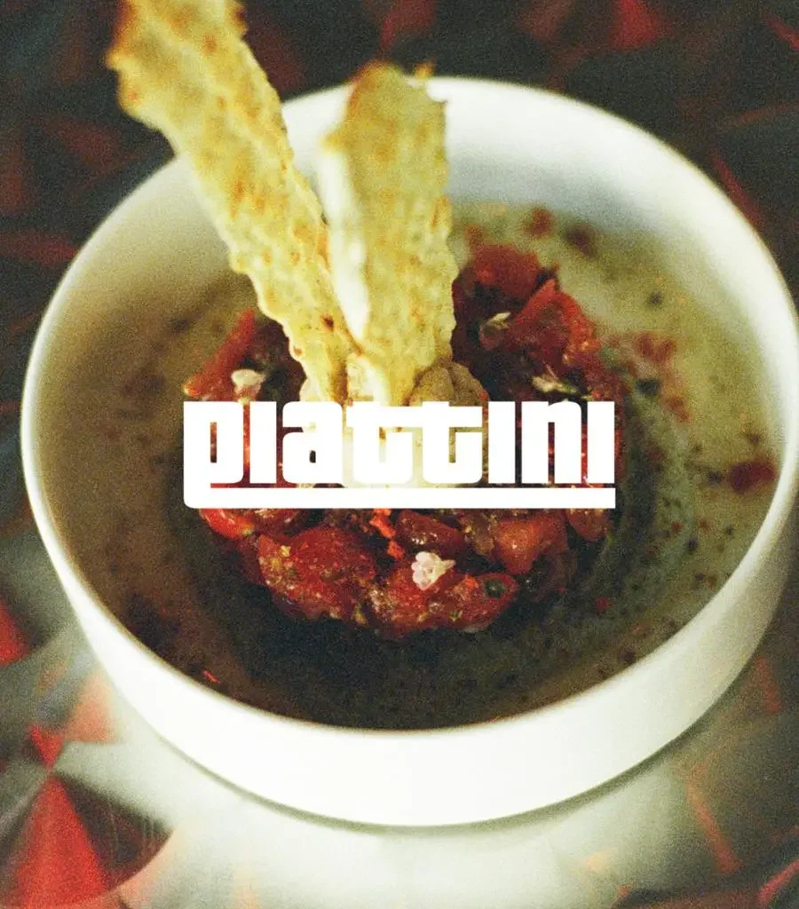
The Piattini logo is striking and bold, making it easy to overlay onto any photo for a clean, professional social media look.
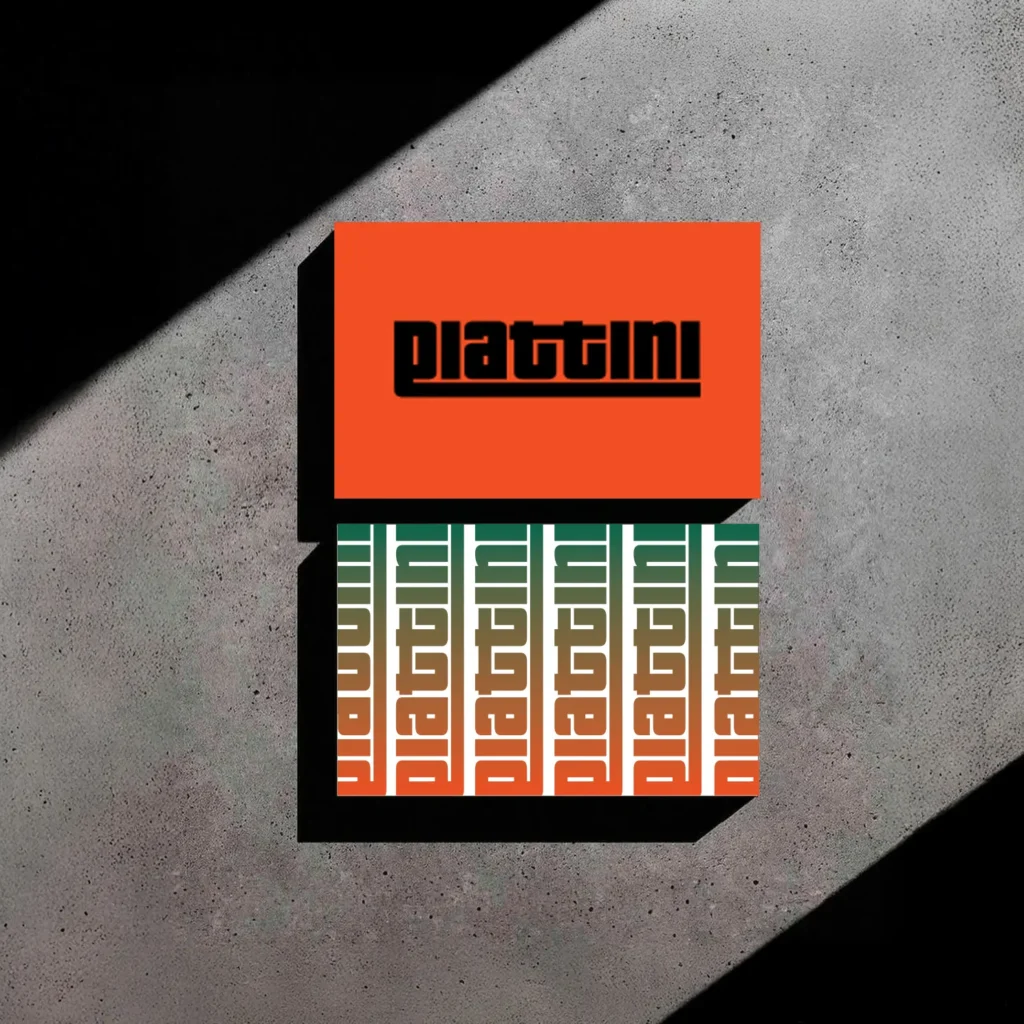
The top business card features a high-impact orange background with the heavy, black logotype for maximum legibility. The second utilizes the repeated logo and gradient, creating a rhythmic pattern that emphasizes the brand’s atmospheric colors.
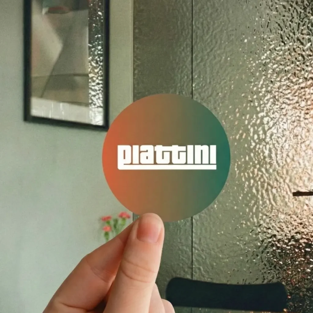
The circular brand sticker features a gradient representing the Venetian sunset. When placed against the hammered metallic wall—designed to mimic the texture of sea waves it creates a mini landscape within the restaurant.